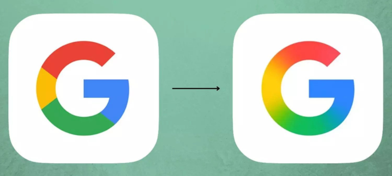
Google has quietly rolled out a redesigned version of its signature “G” logo, marking the first major update since 2015. The new design replaces the classic solid-color segments with a sleek gradient, offering a smoother and more modern visual style.
The refreshed logo is currently live in the latest Google app updates on iOS and on Pixel devices. The gradient effect blends Google’s iconic red, yellow, green, and blue hues, aligning closely with the visual identity of the recently introduced Gemini AI branding.
Also Read: Google to Pay $50M Over Alleged Bias Against Black Workers
Despite the update, the new logo hasn’t yet reached all platforms. Android phones (except Pixel) and the web version of Google still display the older version with its solid color palette.
It’s unclear whether Google intends to roll out the new gradient design universally or keep it exclusive to certain apps and devices for now.


